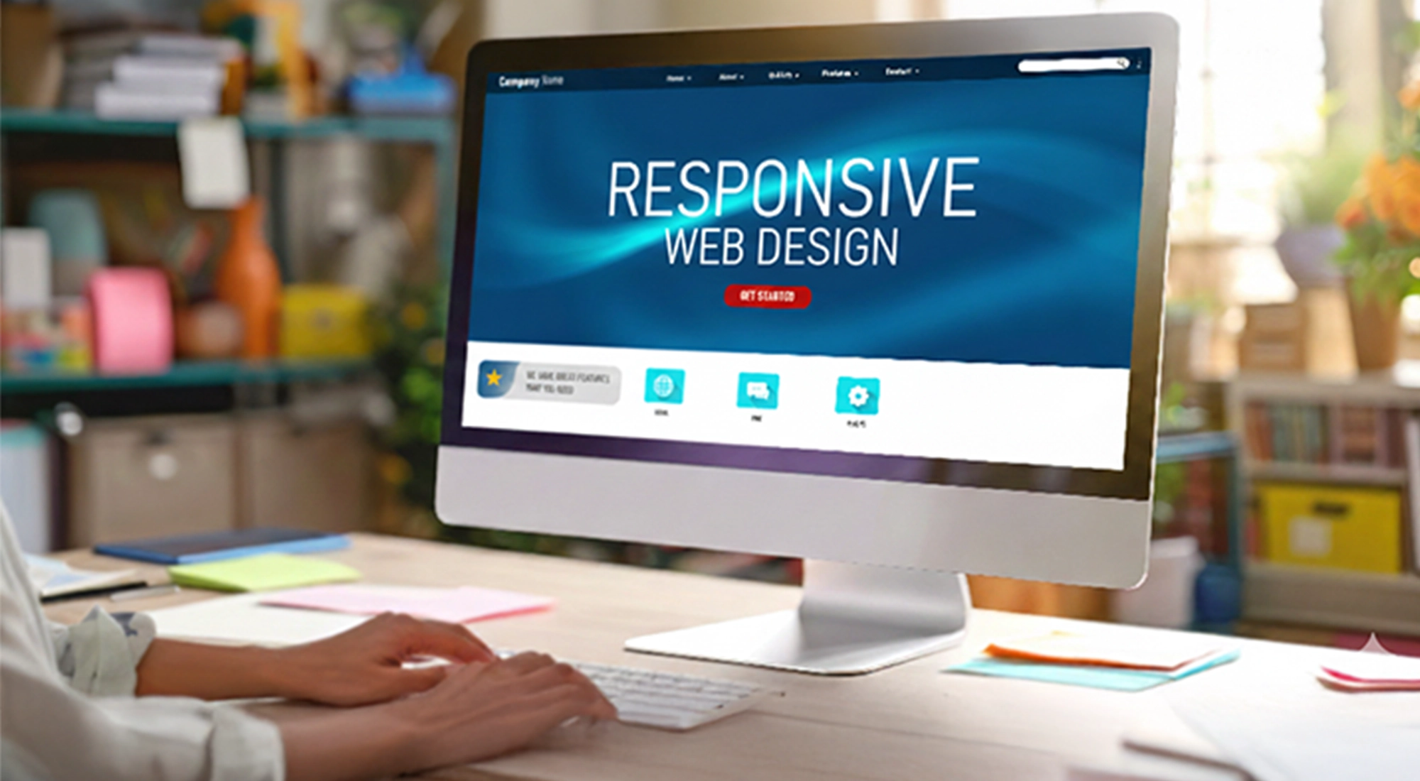
Designing a website for a single desktop screen has become outdated. As technology took over, screen usage in different areas of communication, mobile, and tablets gained popularity. This made web designers rethink their display options across various devices; mostly for phones, desktop, and tablets. This concept emerged as a responsive web design.
How Responsive Design Works for your Website?
Using a responsive web design (RWD) approach enables any webpage or website code and design to respond to the screen size of a device, where accessed. It basically provides an optimal display experience whether you are viewing an android phone, a tablet, an LCD display, or a laptop.
The most preferred responsive site uses flexible images, fluid grids, and CSS to revise the site’s layout as per the width of the browser. Aiming to it, website design and development services in Mumbai look at tailoring the UI and UX of a website keeping it adaptable to different platforms or devices.
Key in Quality Browsing Experience
When different versions of a website are designed and developed only to be accessible on its respective device type, it would consume high efforts, cost, and time. In the long run, it may also be a failure with emerging technological upgrades, making companies spend more on re-coding and site maintenance. Whereas, having responsive website designing can be a seamless solution to keep your website future-ready.
The first step to plan your site’s design can be to know your target audience and what devices they prefer to visit or view. Knowing the ratio of desktop viewers vs mobile vs tablet viewers is always beneficial. Today around 6 billion or even more audiences prefer using mobile/smartphones; thus thinking about mobile design is extremely crucial.
The real challenge appears when the same site is surfed across web browsers that vary. While some web browsers have their own mobile versions that render a site accordingly, some keep varying on their versions for other devices. Also, not all browsers utilize the latest versions and this may get tricky to know what works best for them. Hence developing & designing a site that works and responds to various versions of the browser is the only key for a quality browsing experience.
Adding More to Your User Experience
While creating that perfect experience for your end-users, web design and development companies in Mumbai also consider the following –
- Consider interaction methods and content they prefer while using it on mobile
- Instead of having a design that goes with a screen resolution, focus on the elements & layout that goes with both desktop versions as well adapts well with mobile
- Ensure you do not fill up the mobile screen with text, let it have an engaging flow with a limited amount of space, giving users the ease to scroll through and understand the content at the clarity
- Navigation is an essential element of mobile browsing helps users to get through the right part of your site using menus, dropdowns, scroll pages, and more. Using these elements assures a longer engaging audience to your company site
- Flexible images allow you to reset as per screen types whether a tablet or a television screen or mobile; hence using them is the best practice
- Highly preferred gestures give viewers a hands-on experience to manage the content. Utilizing zoom in, zoom out, copy or highlight text, and several other gesture elements offers more comfort to users.
Call: +91 91525 13159 or Email: sachin@ambestbrandcom.in
