Old Logo
New Logo
Logo Rationale
The structured square frame represents stability and strong foundations, core values in real estate. Its geometric border adds refinement and reflects thoughtful planning and attention to detail.
The bold ‘B’ at the centre anchors the brand with confidence, while the gold tone signals trust and long-term value, perfectly aligning with the tagline “Founded on Trust.”
Logo Mark
Tagline
Founded on Trust
Primary Brand Colours
C: 61%
M: 56%
Y: 53%
K: 26%
M: 56%
Y: 53%
K: 26%
R: 94
G: 91
B: 92
Hex: #5e5b5c
G: 91
B: 92
Hex: #5e5b5c
C: 0%
M: 0%
Y: 0%
K: 0%
M: 0%
Y: 0%
K: 0%
R: 255
G: 255
B: 255
Hex: #ffffff
G: 255
B: 255
Hex: #ffffff
Brand Fonts
Primary Font
Gotham Font Family
Secondary Font
Open Sans Font Family
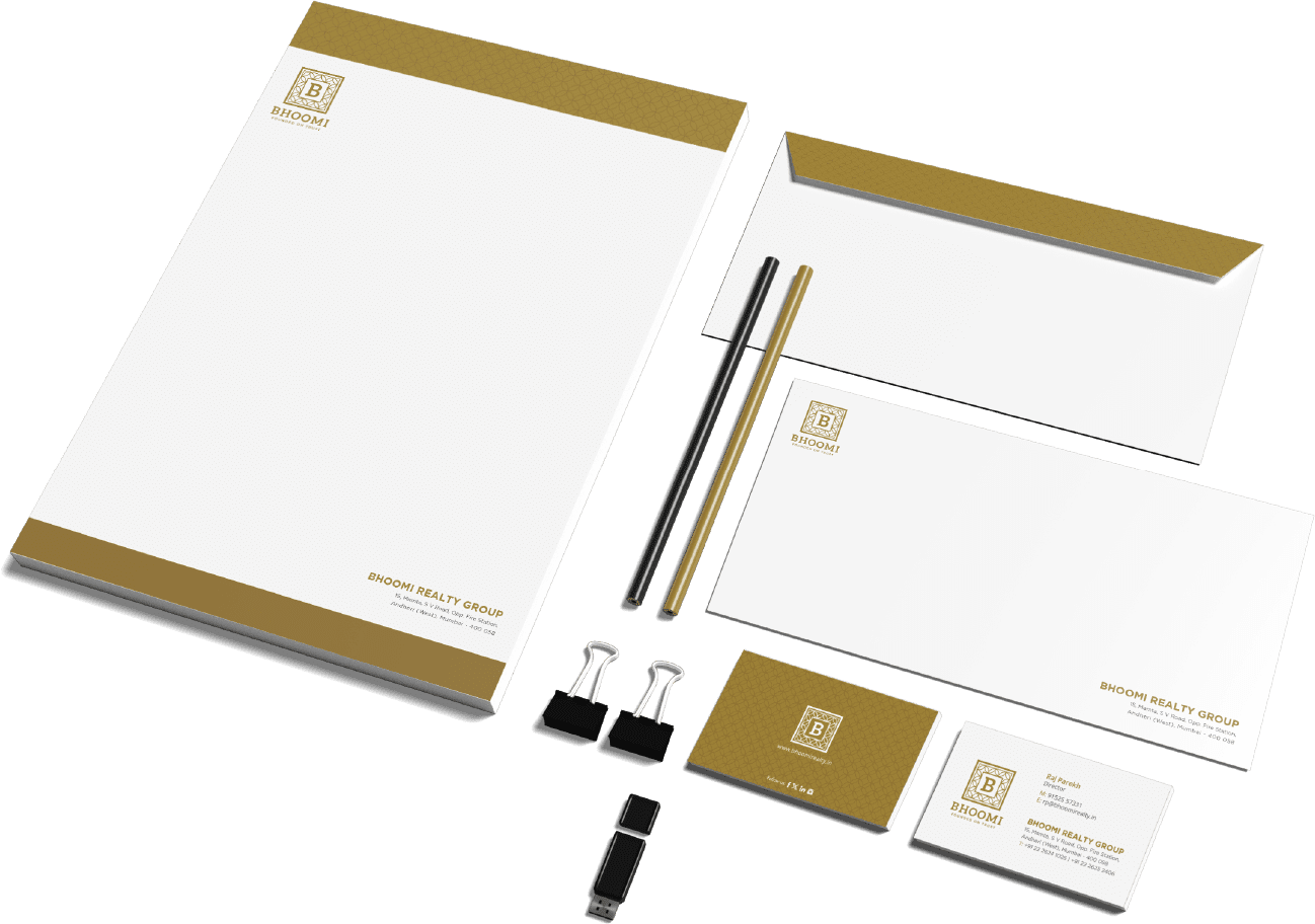
Stationery
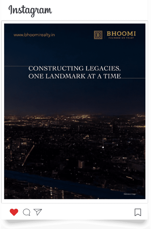
Social Media Posts


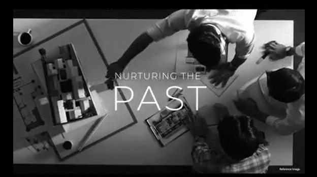
Social Media Reels


Website Design