Logo Rationale
The Bryan & Candy logo uses a clean, structured box design and elegant serif typography to convey trust, quality, and sophistication. The ‘New York’ element adds a global, aspirational touch, reinforcing the brand’s premium positioning.
Overall, the mark reflects a brand rooted in care, refinement, and reliable personal wellness.
Logo Mark
Tagline
A Brand that Truly Cares
Primary Brand Colours
C: 61%
M: 56%
Y: 53%
K: 26%
M: 56%
Y: 53%
K: 26%
R: 94
G: 91
B: 92
Hex: #5e5b5c
G: 91
B: 92
Hex: #5e5b5c
C: 0%
M: 0%
Y: 0%
K: 0%
M: 0%
Y: 0%
K: 0%
R: 255
G: 255
B: 255
Hex: #ffffff
G: 255
B: 255
Hex: #ffffff
Brand Fonts
Primary Font
Calisto MT Font Family
Secondary Font
Segoe UI Font Family
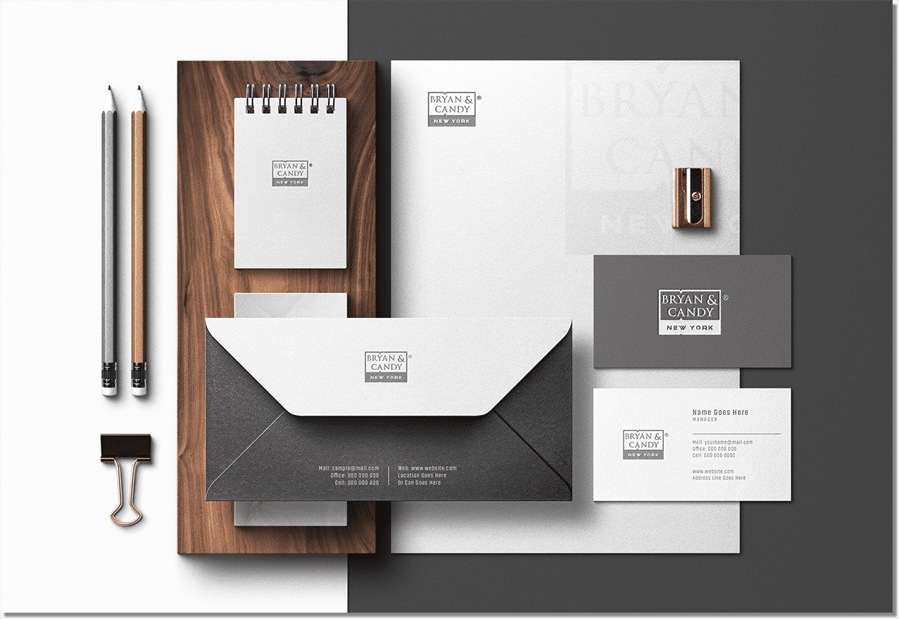
Stationery
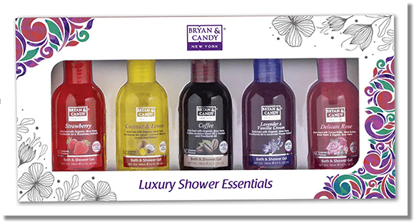
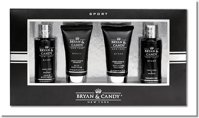
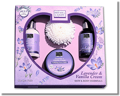
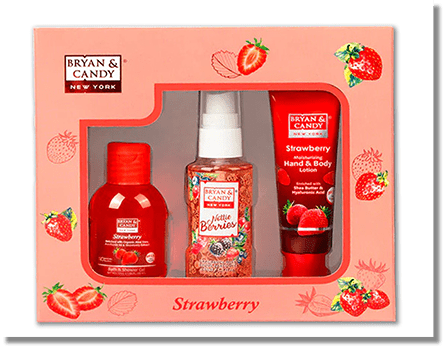
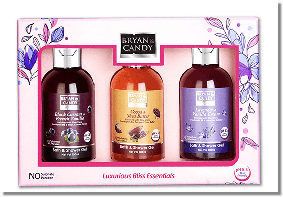
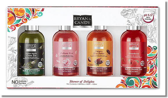
Packaging
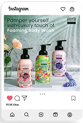
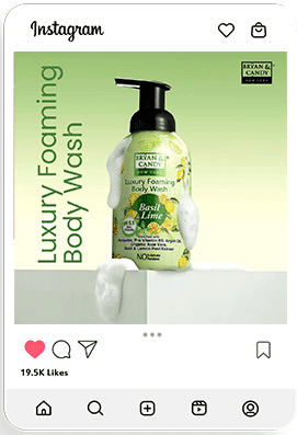
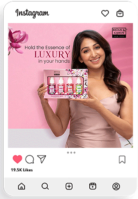
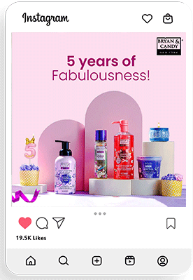
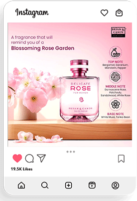
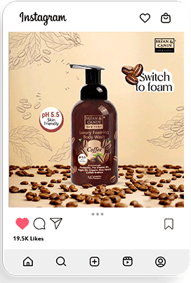
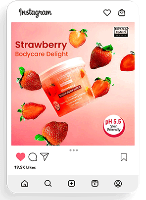
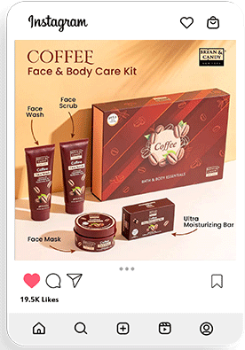
Social Media Posts
45
Professional Crew
45
Professional Crew
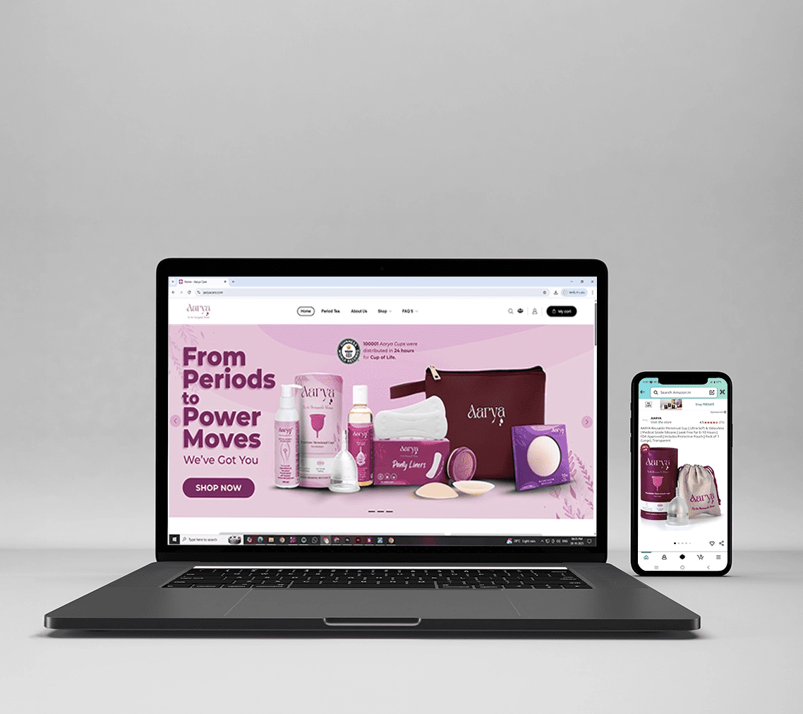
Website Design
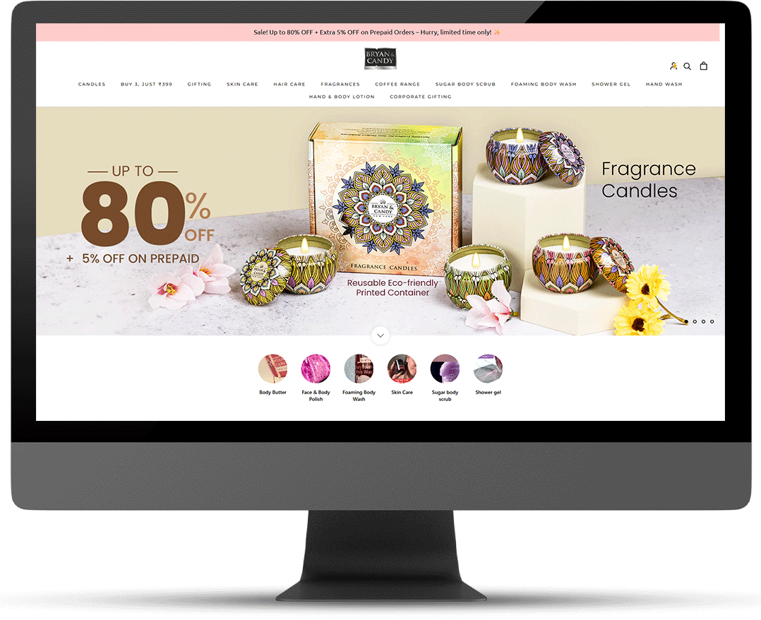
Website + Marketplaces
- Designed & launched brand website for
strong D2C presence - On Amazon: Transformed Aarya Menstrual
Care’s basic seller account into an
advanced seller account - Built a brand store & optimized listings