Logo Rationale
The geometric S symbol represents strength, structure, and modern architectural design. Its sharp lines reflect precision and well-crafted spaces, while the purple-to-blue gradient adds a premium, future-forward feel.
Together, the mark conveys contemporary luxury—perfectly aligning with the promise to “Live the Luxury.”
Logo Mark

Logo Rationale
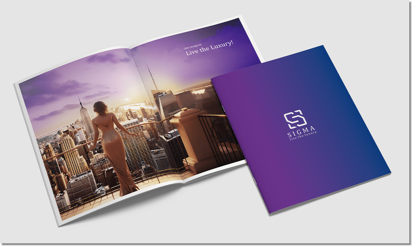
Live the Luxury
Primary Brand Colours
C: 70%
M: 100%
Y: 11%
K: 02%
M: 100%
Y: 11%
K: 02%
R: 111
G: 32
B: 130
Hex: #6f2082
G: 32
B: 130
Hex: #6f2082
C: 100%
M: 90%
Y: 24%
K: 10%
M: 90%
Y: 24%
K: 10%
R: 11
G: 52
B: 122
Hex: #0b347a
G: 52
B: 122
Hex: #0b347a
C: 0%
M: 0%
Y: 0%
K: 0%
M: 0%
Y: 0%
K: 0%
R: 255
G: 255
B: 255
Hex: #ffffff
G: 255
B: 255
Hex: #ffffff
Brand Fonts
Primary Font
Cambria Font Family
Secondary Font
Poppins Font Family
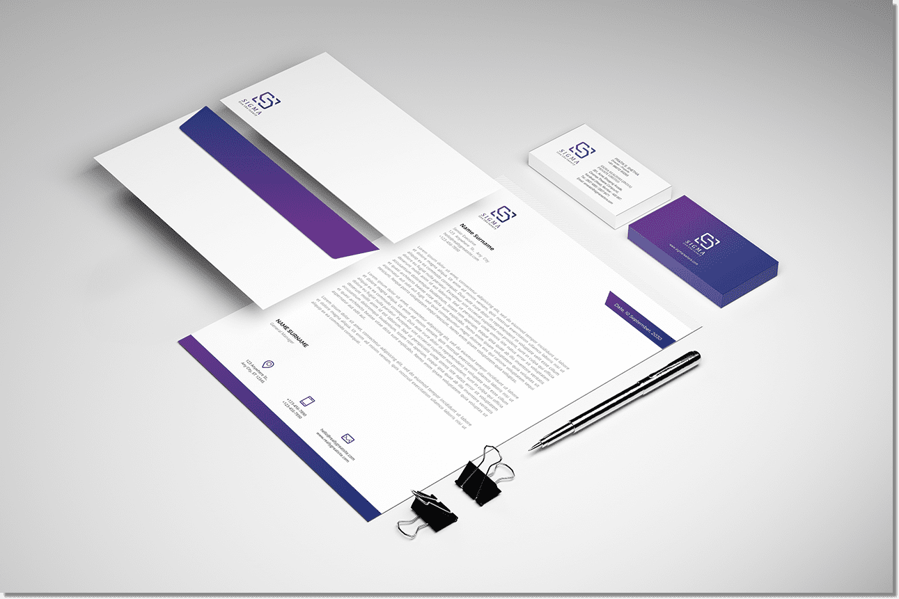
Stationery
Corporate Profile
Website Design

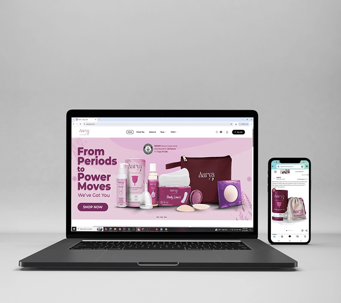
Website + Marketplaces
- Designed & launched brand website for
strong D2C presence - On Amazon: Transformed Aarya Menstrual
Care’s basic seller account into an
advanced seller account - Built a brand store & optimized listings