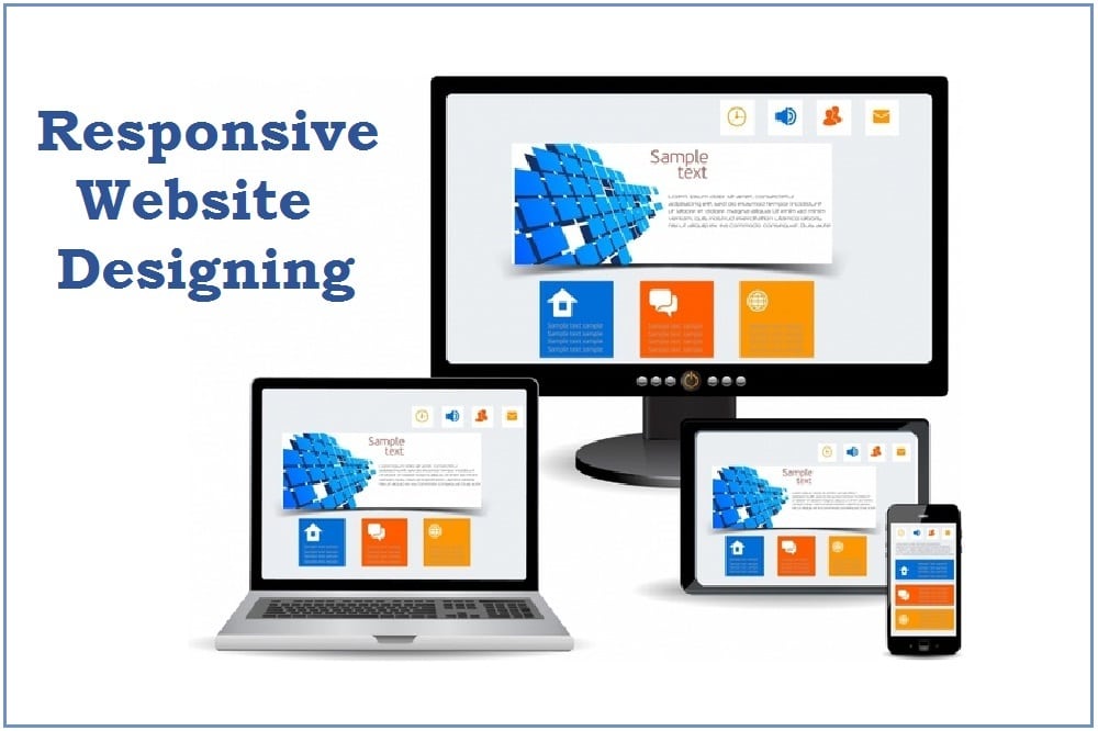
Gone are days people are attracted to static things as the world is gripped by moving things just on fingertips! How can your website be behind then? If you want to make sure there is less bounce rate and visitors stay on your website for a longer duration, it is time that you have the latest trending responsive website to advertise your products and answer the issues!
A responsive website design means it has a modern approach; permits web page rendering & gets automatically adaptive to all screen sizes – desktop, laptop, smartphones, tablets and other smart devices.
How Do I Make My Website Responsive?
The web design and development companies in Mumbai have experienced professionals who are skilled and responsible to make your website responsive. Responsive website designing underlines the fact that you first need to look at its layout. The website design and development services in Mumbai do an excellent amalgamation of HTML and CSS code with the correct use of media graphics for to suit the resolution requirements.
What Are The Different Types of Responsive Layouts?
In responsive website designing, appropriate CSS breakpoints is a must. With this, the website content and media align themselves to devices and adapt to display the whole picture within the available screen to display the whole picture within available screen size such that it gives a pleasing effect to the eyes of the observer. Moreover, according to the web developers, it facilitates visual consumption and ensures maximum reach to the target audience.
As per the web design and development companies in Mumbai the most commonly preferred and used breakpoints in your code are:
· 1920×1080 (8.89%)
· 1366×768 (8.44%)
· 360×640 (7.28%)
· 414×896 (4.58%)
· 1536×864 (3.88%)
· 375×667 (3.75%)
What Are The Components of Responsive Web Design?
The web design and development companies in Mumbai also underline how responsive websites can get you better SEO results. The higher you rank in Google, the more there is the potential of clients finding you on the initial pages of the search results and thus ultimately connecting with you.
Having a responsive web design is the need of the hour as the users of smart devices and screen work grows exponentially in this year, and even forward. If you assess this closely, you would have no doubt on why to change your static image and shift to a dynamic website or also if you want to redesign a new responsive website for your business.
The 3 main elements of responsive web design include:
1. Flexible and Fluid Grid Layout
2. Scalable and Flexible Text & Media representation as per the user’s viewport
3. CSS Media Queries that ensure change and specification of browser’s window as per available size of your browser window
Why Ambest?
Ambest Brand Communication Agency is a firm that surpasses your expectations for responsive website designing. Our team of creative mavericks can give you the newest digital transformations and a staggering online presence with brand /product marketing gimmicks to increase customers. To render our services and make brand growth exponentially, connect with us.

I like the efforts you have put in this, regards for all the great posts.